Year
2026
Client
VLP
Deliverables
Branding & web
Vale La Pierna. Building a brand that turns difference into an advantage and gives underdogs a platform to be seen, heard and celebrated.
The Challenge
VLP had evolved into a growing ecosystem of initiatives, events and creative ventures, each with its own purpose but all united by the same mission: challenging stereotypes and empowering underdogs. The challenge was to create a cohesive brand architecture that could bring every sub-brand together while capturing the bold, unapologetic attitude at the heart of the organisation.
The Solution
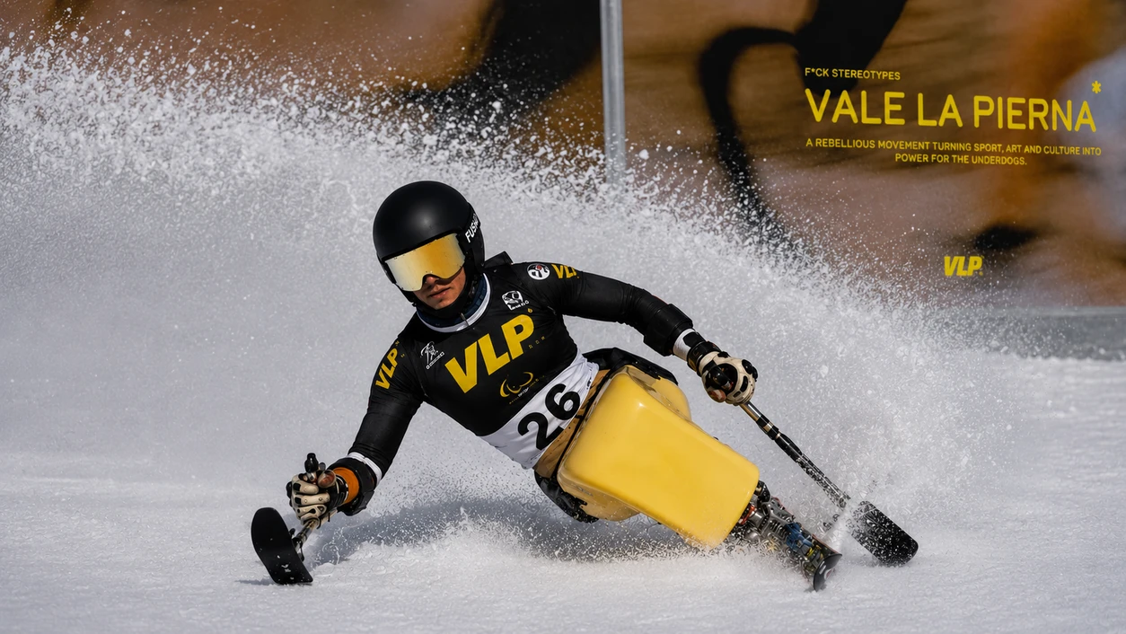
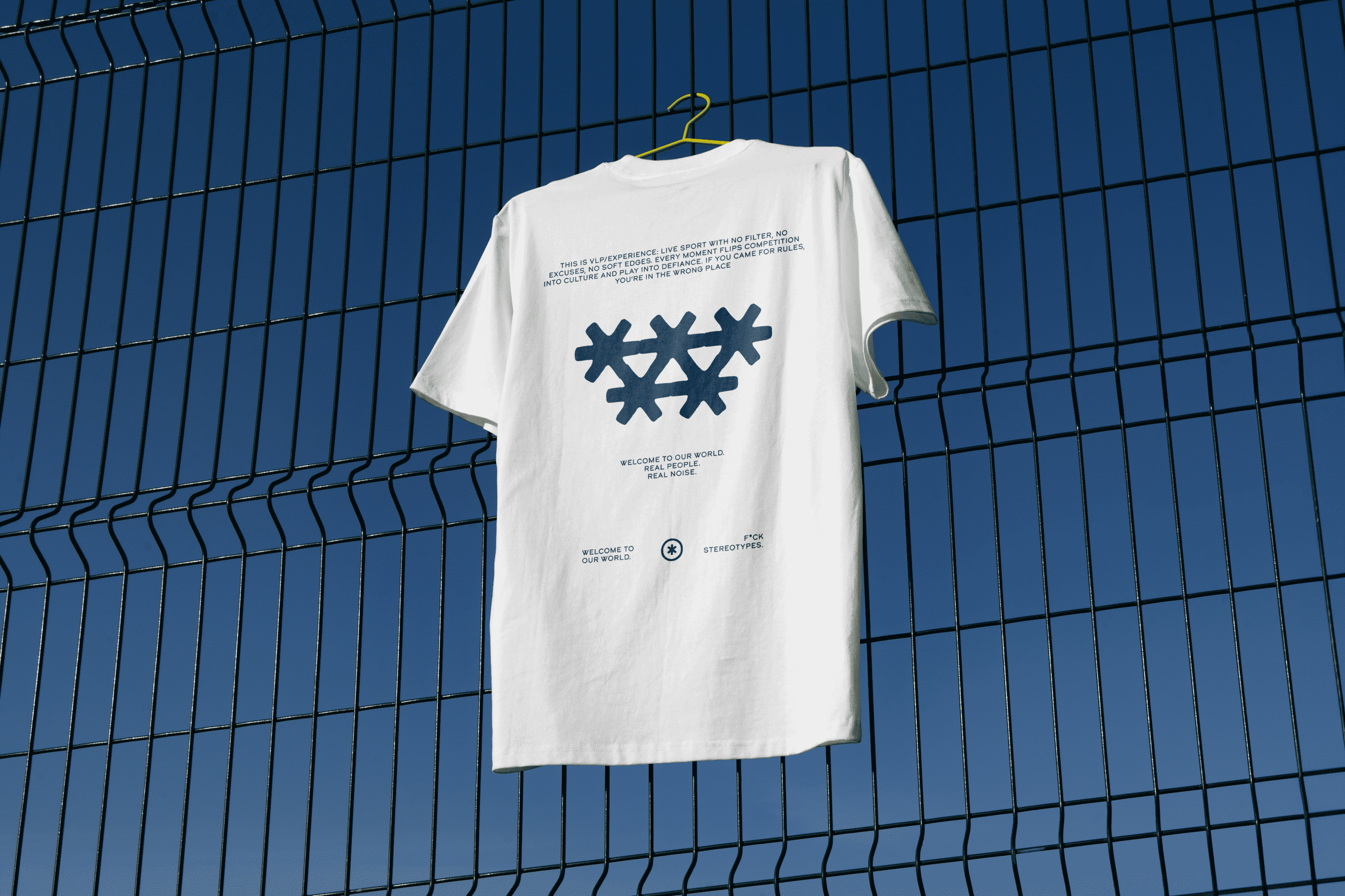
We created a bold and flexible identity system that unifies VLP’s growing ecosystem under a single brand. Built around a vibrant yellow palette, disruptive messaging, expressive typography and the asterisk symbol, the new identity reflects the organisation’s fearless attitude and refusal to fit into conventional categories. Inspired by censored language and taboo topics, the asterisk became a recognisable symbol of rebellion and belonging.




The Web
The challenge was to bring VLP’s unapologetic attitude to the digital world while keeping a clear and intuitive user experience. We designed a bold, high-energy website that makes it easy to explore the organisation’s different initiatives, services and projects, combining strong visual impact with a structure that guides users naturally through the brand universe.
Have a project in mind?

Contact us!